Icon Classes
Icon classes allow icons from supported libraries to be added easily to CH5 projects using inline elements such as <i> and <span>. Icon libraries provide scalable vector icons that can be further customized using CSS.
CH5 provides native support for the following icon classes.
Font Awesome
Font Awesome is a popular way to add font icons to your CH5 projects. Font Awesome icons are created using scalable vectors, so you can use high‑quality icons that work well on any screen size. Font Awesome is designed to be used with inline elements.
The following is an example of a font awesome icon that will be displayed on the page. To display the user icon on the page, the following class needs to be used.
<i class="fas fa-user"></i>In this instance, fas fa- is the predefined class, and user is the name of the icon.
To determine the names of all supported icons, refer to https://fontawesome.com/icons.
Material Design Icons
Material design icons provide simple, modern, and appealing icons for your CH5 projects. Material design icons are optimized to render perfectly across all common platforms and display resolutions.
For CH5 components that accept the iconClass attribute for Font Awesome icons, a similar syntax can be used for adding material design icons.
The following example shows the different between Font Awesome and material design icons for a <ch5-button> component.
<ch5-button size="x-large"
    label="FA Envelope"
    iconClass="fas fa-envelope"></ch5-button>
<ch5-button size="x-large"
    label="MD Envelope"
    iconClass="material-icons md-email"></ch5-button>

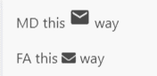
A similar syntax can also be used for inline elements.
<p> MD this <i class="material-icons md-email"></i> way </p>
<p> FA this <i class="fas fa-envelope"></i> way </p>
To determine the names of all supported icons, refer to https://materialdesignicons.com/.